The Stock Market Meter model calculates how many items have risen, remained unchanged or fallen during a day. It also shows the percentage change of the main object. The objects included are those in the object list selected in Viking. It is also possible to get weekly or monthly data if selected from the icons.
The average is based on the number of increases minus the number of decreases for the item list. A simplified RSI.
Do this:
- Select an item list
- Activate the Stock Market Thermometer model.
- Right-click on the chart and select View Model Table.
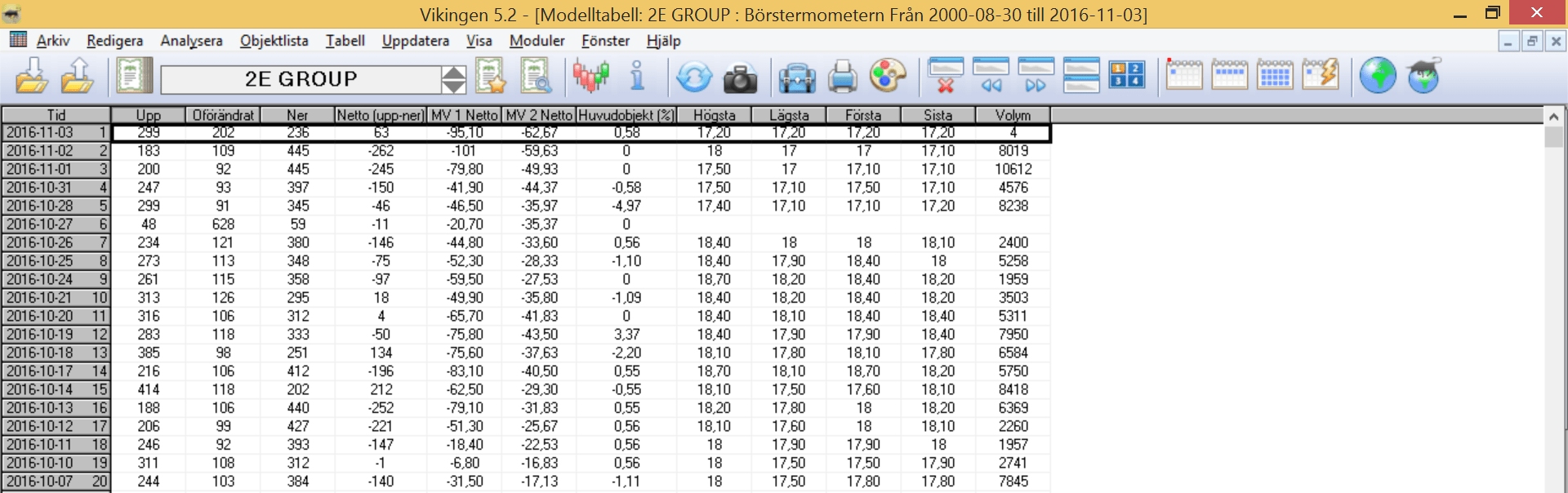
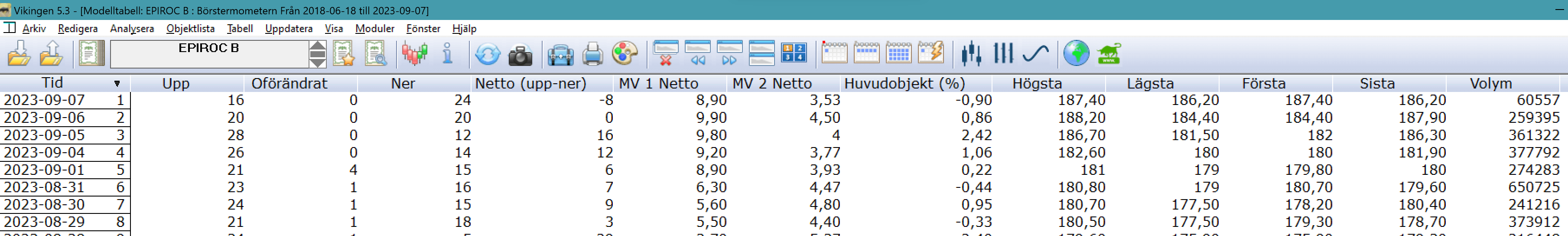
The model table shows the results in numerical form. You can also see the percentage change of the main object. This means that you can choose e.g. OMXS30-Index as the main object in Viking and then run the model on a list and see compared to the index how many shares have gone up or down when the index has gone up or down on a certain day.
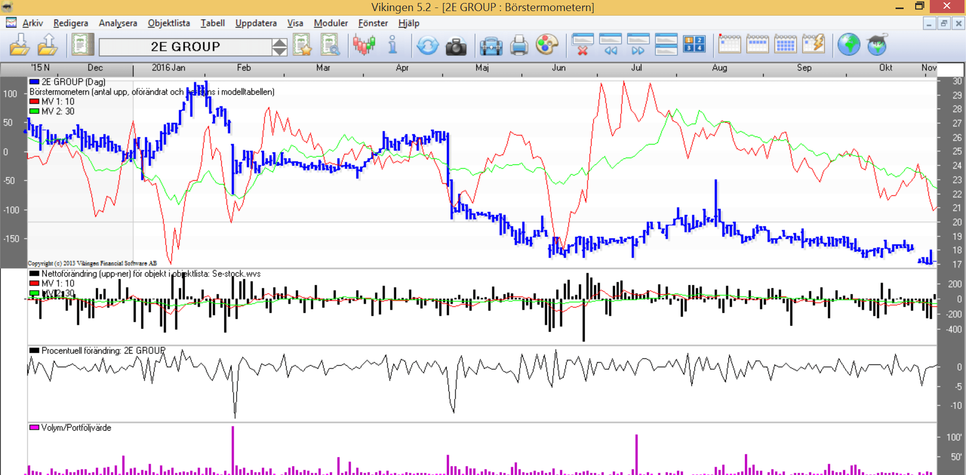
The stock market thermometer takes the temperature of the stock market and at the same time gives you an idea of how the stock you are looking at keeps up with the stock market as a whole. It is particularly interesting to see how it swings back and forth. For example when the number of upswings starts to outnumber downswings and continues to increase. This can be a good time to buy because the stock market usually goes up after a while. The scales are tipping over.
The stock exchange gauge
The Exchange Meter model calculates how many items are traded in a day.
- gone up,
- have remained unchanged, or
- gone down
It also shows the percentage change of the main object. Objects included are those in the object list selected in Viking.
Table
Instead of Day as a period, you can choose Week or Month. That is, how many have gone up/down in a week or month. If so, click on the weekly or monthly calendar at the top of the Viking.
 Or select in the menu File -> System settings ->Models
This is a strength indicator. How strong are the items in the list? It can be a list of stocks, currencies, funds, etc. The net, i.e. the difference between the number of items going up and those going down, shows how strong that list is. It could be your portfolio. Do you have stocks that mostly go down? Then you should probably rebalance your portfolio.
An average net value is also calculated and what can you do with it? This is to get an idea of what is normal for the list. If the net deviates much from its average, it may be time to do something about it.
What can you see in the diagram?
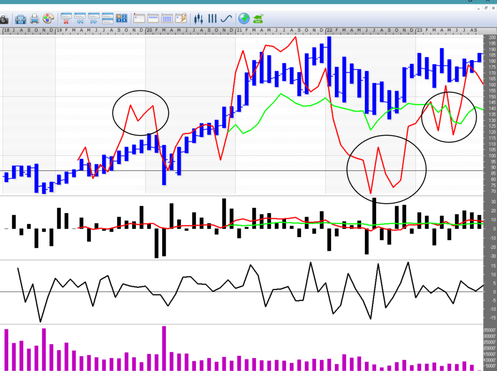
The number of Up-Down is also shown in the RSI model and you can also see when it is overbought or oversold.
A good method is to look at the slope of the short-term average. If it starts to tilt strongly upwards, it is a sign that more items in the list will turn upwards. It’s the other way around. If the mean curves sharply downwards, more items in the list are likely to start going down.
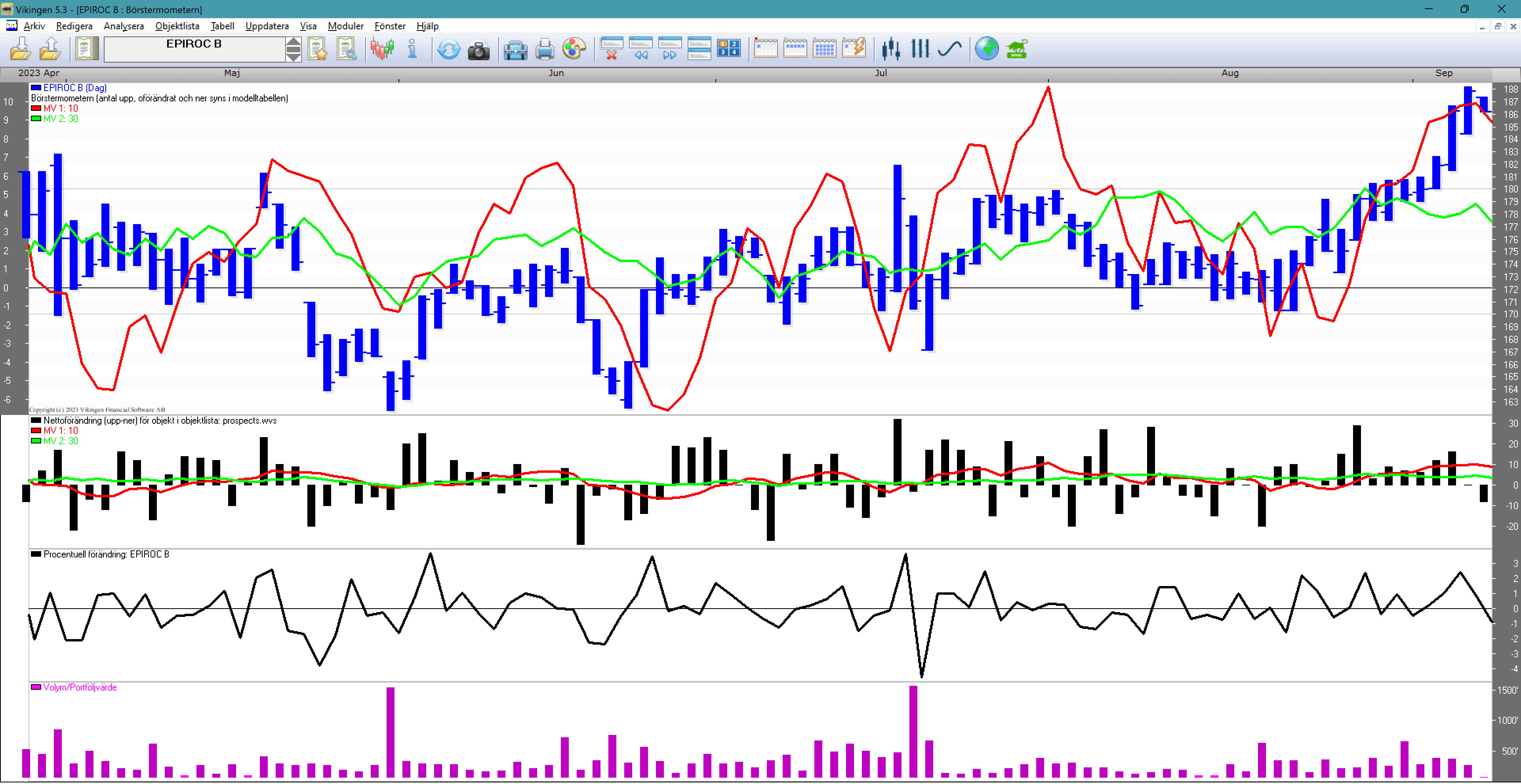
The chart in the example above is based on a list of 40 stocks. The top left-hand corner shows the number of net days included in each average (the number of up days minus the number of down days). In the example, these are averages of 10 days net and 30 days net. The short moves more than the long average. At the end of the chart you can see that the stock has done much better than the 30-day net average. That is, this stock has outperformed most of the list.
The bar chart in the middle shows whether the list is doing well or not. Many bars above zero mean up, and many bars below show that most of the list is going down.
The chart at the bottom shows the percentage rise and fall of the stock, how many percent is normal.
Below is the same stock but with the number of ups and downs based on months. Similar to the RSI, one can see and get signals to sell and buy by detecting double tops and double bottoms. Circled in the image.
To obtain the Stock Exchange Meter, do the following
- Select an item list and activate the Brushometer model. (Analysts -> Models -> Stock market thermometer)
- Right-click on the chart and select “Show model table”.
- The model table shows the results in numerical form.
- You can also see the percentage change of the main object.
Example with an index
Select an item list. For example, choose the OMX Stocholm 30 Index as the main item in the Viking. Then you can compare the list with the index against how many shares have gone up.
or down when the index goes up or down on a given day.