Description:
In the Viking called AD Volume
The A/D model is a variant of the OBV model. Both models try to confirm changes in the exchange rate by comparing with the volume that can be associated with the exchange rate change.
The model was developed by Mark Chaikin who applied a slightly different approach to the OBV model. He chose to ignore the change from one period to another and instead focus on how the price moves within a given time period. Chaikin developed a formula to calculate a value based on the position of the closing price relative to the range of the price for the same period. The value is called CLV and ranges from +1 to -1. The CLV is then multiplied by the volume and the sum forms the A/D line in the model.
When the A/D line moves upwards, it indicates that a stock is in the accumulation phase, ie. are bought more than sold. This is positive because increased volume and simultaneous price increases are considered “bullish”.
When the A/D line moves downwards, it indicates that the stock is entering a distribution phase, i.e.. sold more than bought.
Interpretation:
Identify the main trend of the A/D line. Where divergence between the price and the A/D line occurs, it is time to pay closer attention. If the A/D line moves up and the price moves down, it is likely that the price will reverse i.e.. start moving upwards soon.
Note that young divergences, or those that are relatively flat, should be viewed with healthy skepticism.
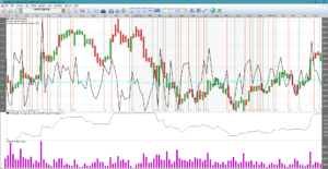
In Viking, the A/D Volume model looks like this:
According to Viking help file the model is calculated in the same way using the same formula.
As you can see, this can’t be fully correct because there are buy and sell signals in the short term and no longer trend with divergences can be found. Personally, I have not been able to set good values for the average so that I get longer-term signals.
ACCUMULATION – DISTRIBUTION VOLUME
AD Volume
Wärtsilä gave 39 times the money with 108 weeks AD Volume average of 30 years. Wow, maybe this is a good model?
One idea with this model is that if you take the volume and mix it with a nice model like Stochastics, there should be good signals for buying and selling.
Stochastics is like a temperature gauge. When the average of the last payment is on the upper side of the bar, the stock is trending upwards. Amplifying that signal with volume should give good early signals. For a sustainable signal to provide a longer-term trend, we want the volume to be large and increasing. Applies to both buy and sell signals. Another thing about volume is that there can be an upswing. That is, if the volume is increasing and the price is flat, it is likely that the price will soon go up. This can be easily seen in an AD Volume chart. Because when last paid starts to settle on the upper half of the High-Low and the volume increases, it is easier to see it in the AD Volume chart.
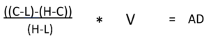
C = Close, Last L = Lowest, H = Highest, V = Volume AD=Accumulation, Distribution
If C=L, it is -(H_L)/(H-L) times the volume, i.e. -1*V. On the contrary, if C=H, then it is 1*V. The value thus varies between Volume and – Volume. Of course, the volume also varies. You could say that you get a stochastic weighted turnover. Moreover, if the volume (turnover) is high, the extreme values become more apparent.
In AD Volume you want to see if the average of AD Volume confirms the price. The average value is calculated by calculating for each period all AD Volume values and summing these values for a time. Finally, the sum is divided by the number of periods in the time period.
How good is the model?
What is the best period value? An optimization on 323 Nordic most traded stocks yielded only 49 positive results with an average of 227 days. Unfortunately, there were very different periods between stocks. In Viking, the unique period per share, index, option, etc. is saved…. when you have run an optimization in Vikingen Trading, i.e. a back testing.
Same with weekly data, scattered values, average of 167 weeks. For example, for Volvo B, the best was a 348-week average, giving a 222% increase in 43 years. A rather mediocre rise for such a long time. 233 out of 476 transactions made a profit when the computer was at its best. Fairly well, about half of them made a profit. But the results are significantly worse than Bollinger, Multimodel, MRudolph3, Kursband, BEST and Peter’s specialists.
For monthly values, there were also scattered values, with an average of 70 months. However, the chance of winning was greater. About 6 out of 10 transactions made a profit. For Volvo, 53 out of 84 transactions were profitable. 782% increase. Most people have the idea that you get richer the more you are updated. But when you run tests, it is almost always the case that weekly or monthly data is best. In other words, it is sufficient to monitor the price once a week or month. …… But it’s not as much fun and the banks don’t earn much from it.
Interpret the AD Volume charts
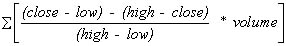
If the closing price is closer to the highest price than the lowest price, we have an accumulation. If instead the closing price is closer to the minimum price, we have a distribution instead. A change in a rising price trend is signaled if higher and higher peaks in the price curve do not coincide with higher and higher peaks in the mean of the AD curve.
Similarly, in a declining price trend, a reversal can be expected if the average of the AD curve’s peaks starts to reach higher and higher levels.
Price charts provide an alternative way to see if the peaks and troughs of price and volume confirm each other or not. This is done by studying whether rising peaks in the price correlate with rising peaks in the volume and vice versa.
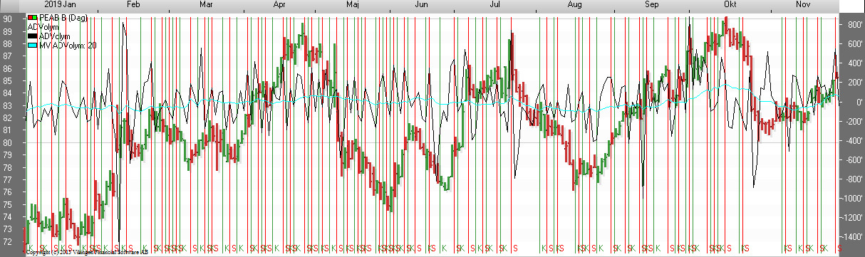
Buy signals are given when the average curve for AD Volume crosses a bottom. Sell signals are given when the same curve has passed a peak.
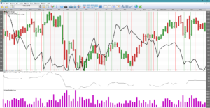
In the chart you can see that there are too many signals, especially when the price is stationary. A common problem with engineering models. You can see that it looks good when the AD Volume curve goes in the same direction as the curve. That is, the model becomes a complement to other models. The AD Volume model shows whether there is a healthy relationship between volume and last paid in relation to highest and lowest.
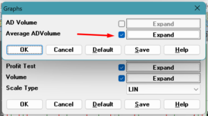
To show only the mean value of AD Volume as in the graph above, right click on the graph -> click on model parameters -> click on graphs and then just check the Mean AD Volume box. Press OK for a temporary change or Save for a permanent change.