Do Candlesticks work in the foreign exchange market?
One way to find good deals, the only way according to some, is technical analysis. There are many different approaches to technical analysis, but one of the indicators that has proven to work best is Candlesticks. Many people wonder if this method of technical analysis works for currencies, on forex.
The answer is absolute. There are several different types of graphs to follow what is happening in the currency market. One of our favorites is candle charts, where certain pillars of the graph can look like candles. But how does this relate to forex trading and what can you learn from candlestick charts?
What are Candlesticks?
Candlesticks provide a range of information on currency price movements, helping to identify trading strategies. Trading forex with Candlesticks charts is a useful skill to have and can be applied to any market.
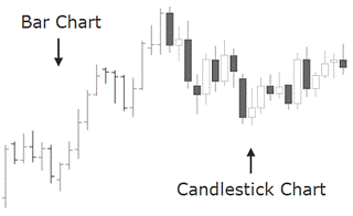
What could possibly be more important to a technical currency trader than price charts? Forex charts come standard with Candlesticks which are very different from the more traditional bar chart and the more exotic renko charts. These forex candlestick charts help inform an FX trader’s perception of price movements – and therefore shape opinions on trends, determine entries and more.
All forex traders should have knowledge of Candlesticks and what they indicate. After learning how to analyze currencies for Candlesticks, traders often find that they can identify many different types of price action much more effectively compared to using other charts. The added benefit of forex Candlesticks analysis is that the same methodology applies to Candlesticks charts for all financial markets.
The Japanese candlestick system is considered quite related to the bar chart system, as it also shows the four main price levels for a given time period. So what makes them the favorite chart form among most Forex traders? The answer is that the candlestick has many qualities that make it easier to understand where the price is headed, allowing forex traders to make faster and more profitable decisions. Japanese candlestick is believed to be one of the oldest types of chart in the world. It was originally developed in Japan several centuries ago for the purpose of predicting price in one of the world’s first futures markets. Below you will find a compilation of 12 main signals to learn how to use Japanese candlestick.
How do you use the candlestick?
Learning candlestick in groups is much like recognizing family members. If a large number of relatives were spread out among a crowd of strangers, it would be easy to miss them. But if the relatives were all brought forward and arranged in family units, it would be fairly easy to spot them, even if they scatter back into the crowd again.
Candlestick, like relatives, can be grouped together and taught in family groups. They can be direct relatives or cousins. As in any family, some of the cousins may be a bit odd, but in perspective they still fit and are much easier to remember if they can be placed in a family.
Candlestick patterns have very strict definitions, but there are many variations of the mentioned patterns, and the Japanese did not give names to patterns that were “really close”. Experience and common sense allow traders to read the signals even if it does not exactly match the picture or definition in the book.
Candlestick as an analytical tool
A chart is mainly a graphical overview of price information over time. Technical indicators and trend lines can be added to it to determine entry and exit points, as well as at what prices to stop. All these charts can also be displayed on an arithmetic or logarithmic scale. The types of charts and the scale used depend on what information the technical analyst considers to be the most important and which charts and scale best display that information.
If your interest is a qualitative view of the market, because you want to show data that has had a large share of the price increase, usually longer charts, it is more appropriate to use a logarithmic chart. While arithmetic shows price changes in time, logarithm shows the proportional price change which is very useful for observing market sentiment. You can know the percentage change of the price over a period and compare it with previous price changes to assess how bullish or bearish market participants are feeling.
In the foreign exchange market, the arithmetic scale is the most appropriate chart to use as the market does not show large percentage increases or decreases in exchange rates. On an arithmetic chart, equal vertical distances represent equal price ranges, usually seen with a grid in the background of a chart. The arithmetic scale is also the most suitable to use technical analysis tools and detect chartist patterns due to its quantitative nature. In addition to the arithmetic scale, the Forex world has also adopted the Japanese Candlestick charts as a means to access both quantitative and qualitative views of the market. They were chosen among other types of charts – the two most common are ‘line ch arts’ and ‘bar ch arts’ – because of their attributes as we will see in this chapter.
One way to look at prices
The line chart is the simplest form of depicting price changes over a period of time. The line is displayed in charts by showing a series of single points, usually the closing prices (close) for the time interval. This simple mapping method makes it easier to assess the direction of a trend or to compare the prices of several instruments on the same graph.
The Japanese candlestick system is considered quite related to the bar chart and the bar graph, as it also shows the four main price levels for a given time period. Candlestick has many qualities that make it easier to understand where the price should price up to, leading traders to faster and more profitable trading decisions. Japanese candlestick charts are believed to be one of the oldest types of chart developed in Japan centuries ago to predict price in one of the world’s first futures markets. In the 18th century, Munehisa Homma became a legendary rice trader and made a huge fortune using candlestick analysis. He found that while supply and demand affected the price of rice, markets were also strongly influenced by the emotions of participating buyers and sellers.
Homma realized that he could benefit from understanding the emotional state of the market. Even today, this aspect is difficult to understand for most financial market participants. Homma’s advantage was what helped him predict future prices. His understanding was that there is a difference between the value of something and its price. The same difference between price and value applies today in the currency market, just as it did in the rice market in Japan centuries ago. Compared to lines and bar charts, candlesticks provide a simpler picture that allows the illustration of ongoing supply and demand imbalances to be understood. They also show volumes about the psychological and emotional state of market participants, which is an extremely important aspect we will cover in this chapter.
An advantage is that in candlestick charts, the candles are colored in accordance with the price movement: when it opens higher than the closing price, the candlestick is colored with a “filled” body and when the candlestick shows a “hollow” body, it means that the closing price was higher than the subsequent opening price.
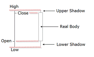
The body of the candlestick, also called the ‘real’ body, represents the interval between the opening and closing price. In an instant, you’ll notice the direction in which the price is heading. This is just one of the many conventions and the one we will use here, as each charting service can color the bullish and bearish candles differently. Below is an example of a candlestick and a definition for each candlestick component. The fixed part is the body of the candlestick.
The lines at the top and bottom are the upper and lower folds, also called tails or shadows. The very top of a candle wick is the highest price for that time period, while the bottom of the wick is the lowest price for that specific period. Another advantage of using a candlestick chart is that you can combine them with conventional market indicators such as moving averages and trend lines. But the most prominent benefit of these charts is the early warning signs when changes in trends occur.
Before you can understand trading strategies and candlesticks, you need to have a solid understanding of what is behind the creation of candlesticks. There are many conventional designs used by traders around the world. If all these strategies worked and trading was so easy, they would all be very profitable. The reality is that most traders lose money. One of the main reasons they lose is that they don’t understand what those candlesticks represent, which is an ongoing equation equation equation. In this session, we will spend time looking at candlesticks not based on conventional patterns but instead through the eye of supply, demand and order flow.
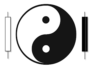
Ying Yang
Traditionally, Japanese traders attribute yang qualities (expansion) to bullish candles and yin qualities (contraction) to bearish candles. When yang reaches an extreme value, there is stillness, and stillness gives rise to yin. A reversal of market forces follows the same principle: a high bullish candle showing a yang quality gives rise to stillness expressed in the small real body of the following candle; and the stillness gives rise to yin, which appears in the form of a long bearish candle that completes the reversal pattern. This balance between ying and yang forces is another way of looking at oscillatory movements in price that is similar to the wave principles.
Candles can be used across all timeframes – from intraday to monthly charts. For example, on a weekly chart, an individual candle line would consist of Monday’s Open, Friday’s Close, and the week’s High and Low; while a four-hour candle would contain the same price levels for that period.
Candlestick terminology
Some traders are sometimes confused by the language surrounding candlesticks. In fact, it’s actually quite simple: the names of the patterns often tell you what inherent message each pattern sends. Initially, inherent formations were accordingly labeled in part to the military environment of the Japanese feudal system during that time. Therefore, you will find terms such as “penetrating”, “supporting” and “three advancing soldiers” that definitely reflect a military unit. But candles were also given other more mysterious names that may sound unusual at first but are actually very descriptive like “dragonfly” or “morning star”. Steve Nison explains in one of his books on the subject:
A fascinating attribute of the candlestick charts is that the names of the patterns are a colorful mechanism that describes the emotional health of the market at the time of these patterns. After hearing the phrase “dark-cloud cover”, do you think the market is in an emotionally healthy state? Of course not! […]
It is of course a bearish pattern and the name clearly conveys the unhealthy state of the market. […] The descriptive names used by the Japanese not only make candlesticks fun, but easier to remember whether the patterns are bullish or bearish. For example […] “evening star” and “morning star”. Without knowing what these patterns look like or what they mean for the market, just by hearing their names, which one do you think sounds bullish and which one is bearish?
The evening star (the nickname for the planet Venus), which comes out before nightfall, sounds like a bearish signal – and it is! The morning star is then bullish as it (the planet Mercury) appears just before sunrise.
Source: “Japanese Candlestick Charting Techniques, A Contemporary Guide To The Ancient Investment Techniques Of The Far East” by Steve Nison, Prentice Hall Press, Second Edition, 2001.
In a universe of dozens of Candlestick patterns, it has been shown that a small group of them provide more trading opportunities than most traders will be able to exploit. In this section, 12 patterns are dissected and studied to give you enough insight into a fascinating way to read them. The following is a list of these selected Candlestick patterns.
2.1. Marubozu candle holder
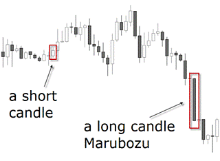
Although this formation is not one of the most talked about, it is a good starting point to distinguish long lights from short lights. A marubozu is a single candlestick pattern that has a very long body compared to other candles. While this is considered a confirmation of the market’s direction, it suggests entering the movement when the price has already moved a lot. The resulting risk associated with this signal makes marubozu not so popular compared to other formations.
It signals a strong buy when the close is significantly above its opening price, and vice versa when the candle is bearish. A short candle is of course the opposite and usually indicates slowdown and consolidation. It occurs when trading has been restricted to a narrow price range during the lifetime of the candle.
The smaller the real light body of the light, the less weight is given to its color whether it is bullish or bearish. Notice how marubozu is represented by a long-bodied candlestick that contains no shadows.
2.2. Doji candlestick
When faced with a doji candlestick pattern, the Japanese say the market is “exhausted”. Doji also means that the market has moved from a yang or ying quality to a neutral state. In Western terms, it is said that the trend has slowed down – but this does not mean an immediate turnaround. This is an often incorrect interpretation that leads to a misuse of dojis.
Although the odds of a market reversal increase with a doji, there is still a lack of confirmation to trade on. Doji is formed when the trading session opens and closes at the same level. This pattern indicates that there is a lot of determination about what should be the value of a currency pair. Depending on the shape of the shadows, dojis can then be divided into different formations:
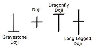
A long-legged doji candlestick is formed when OPEN and CLOSE are similar. The Dragonfly doji shows a session with a high opening price, which then experiences a noticeable decline until a renewed demand brings the price back to end the session at the same price it opened.
At the top of a trend it becomes a variation of the hanging man; and at the bottom of a trend it becomes a kind of hammer. It is thus seen as a bullish signal rather than neutral. A tombstone doji is the opposite of the dragonfly doji.
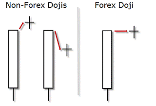
Appropriately named, they should anticipate losses for the base currency, as any profit lost at the end of the session is a sure sign of weakness. The Japanese analogy is that it represents those who have died in battle. Dragonfly and gravestone dojis are two general exceptions to the claim that dojis are inherently neutral. In most light books you will see the dojies with a gap down or up in relation to the previous session. In Forex, however, the dojis will look a little different as shown in the picture below.
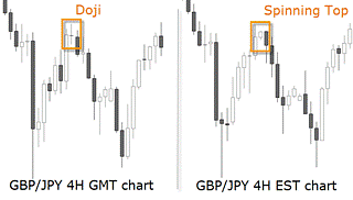
2.3 spinning Top candlestick pattern
In Forex, you can consider the doji and a spinning top to have the same potential for reversal. For example, if a market reaches a new top as shown in the image below, and does so with a doji or a spinning top – that is a small real body with a long upper and lower shadow – the signal is the same: the market rejected the higher levels and shows determination on where to go next.
How can I deal with the fact that different graphs show different candlestick patterns due to their time zone? For the Forex market, we suggest the use of a GMT chart as most institutional volumes are handled in London. This is especially valid if you are working with daily charts, but intraday charts that are over 1 hour also show differences in the pattern. In any case, due to the 24-hour nature of the forex market, the candlestick interpretation requires some flexibility and adaptation. You will see how some of the textbook patterns look slightly different in Forex than in other markets.
The following patterns are thought to be to alert the trained eye that pending reversals offer the opportunity for a trader to get early on a possible new trend, or to alert the forex trader who already has money invested that the trend is ending and the position requires attention.
2.4. Engulfing Pattern
Many single candlestick patterns, such as animals, hammers and hanging man, require confirmation that a trend change has occurred. They become more significant to the market when they meet the following criteria: they must appear after an extended period of long candle bodies, whether bullish or bullish; and they must be confirmed with an engulfing pattern.
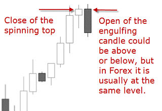
This pattern occurs when one light body completely engraves the body of the previous light. A bullish engulfment usually occurs when there are short-term bottoms after a decline. In Forex, a bullish engulfing will rarely open below the last candle’s close, but usually at the same level. But a bullish engulfing will always close above the previous OPEN candle, and a bearish engulfing will always close below the previous OPEN candle.
See below the image of a bearish Engulfing Pattern for a better understanding. When Engulfing Patterns occur in a downtrend, it indicates that the trend has lost momentum and bullish investors may be getting stronger. Conversely, a bearish engulfment will occur when the market is at the top of a trend.
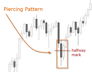
2.5. Piercing patterns
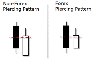
This pattern is similar to the upswing with the difference that this one doesn’t quite beat the previous candle. It occurs during a downtrend, when the market gains enough strength to close the candle above the midpoint of the previous candle (note the red dotted halfway mark). This pattern is seen as an opportunity for buyers to enter as long as the downstream would be exhausted.
A piercing pattern in Forex is considered as such even if the closing of the first candle is the same as the opening of the second candle.
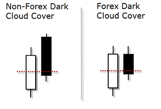
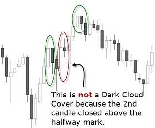
2.6. Dark Cloud Cover pattern
This pattern is the opposite of the piercing pattern. It occurs during an uptrend when the session opens at or slightly above the previous closing price, but demand cannot be sustained and the price loses ground falling below the midpoint of the previous candle. This pattern indicates the possibility for traders to take advantage of a trend reversal by positioning themselves short at the open of the next candle. It can also be used as a warning sign for bullish positions as the price may enter a resistance zone. The table below shows some differences between ‘real’ and ‘fake’ dark cloud cover. While the green circled patterns meet all the recognition criteria, the red circled ones do not.
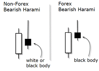
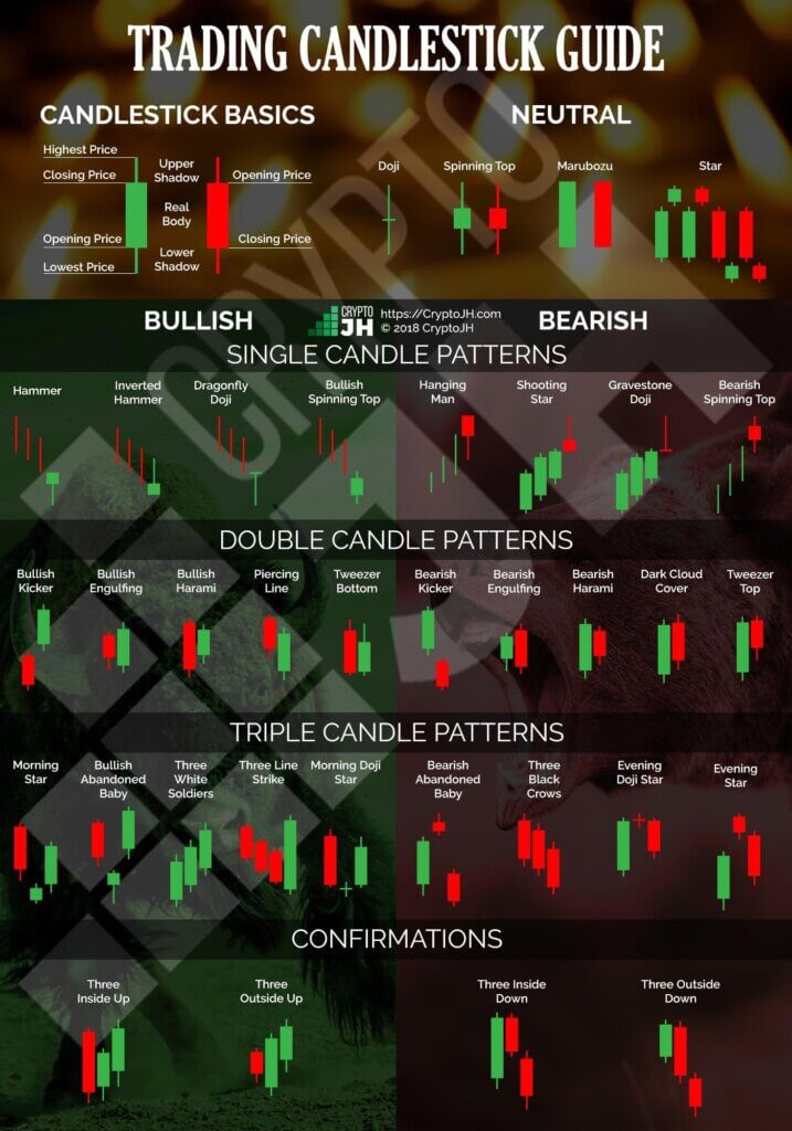 2.7. Harami pattern
In a Japanese Candlestick chart, a harami is recognized by a two-day reversal pattern showing a small body candle fully containing the area of the previous larger candle’s body. This formation suggests that the previous trend is underway.
The smaller the second candlestick, the stronger the reversal signal. On a non-Forex chart, this candle pattern would show an inner candle in the form of a doji or a spinning top, that is, a candle whose real body is engulfed by the previous candle.
The difference is that one of the shadows of the second light can extremely refract the previous lights. In Forex charts, however, there is usually no gap on the inside of the previous candle. The Harami pattern can be bullish or bearish, but it must always be confirmed by the previous trend. An important criterion in a Forex chart (as opposed to a non-FX chart) is that the second candle must be a different color than the previous candle and the trend.
The above illustration shows a bearish harami confirmed by a trend and a massive body candlestick. The larger previous candle shows a clear direction, but when the hesitation of the harami is printed on the chart, it requires a confirmation of where the market is going now. Later in this chapter we will see how to get a confirmation of candlestick patterns.
2.8. Hammer candlestick pattern
There are few designs where the shadows play a more important role than the body. One of these is the hammer, which consists of a single candle. It is so called because the Japanese will say that the market is trying to hammer out a base. A hammer shows in the picture that the market opened near its high, thus during the session, and then rallied sharply to close well above the extreme low. Note that it may close slightly above or below that opening price, in either case it would meet the criteria. Because of this strong demand at the bottom, it is considered a bottom reversal signal.
A perfect hammer in Forex is the same as in any other market: the tail must be twice the length of the body and the body must be near or at the top of the candle. This means it can have a small upper shadow, but it must be much smaller than the lower shadow. The smaller the body and the longer the tail, the more significant is the interpretation of the hammer as a house signal. Another important criterion is the color of the body: the candlestick can be bullish or bearish, it doesn’t matter.
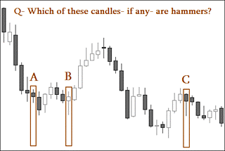
Most designs have some flexibility so much more illustrations would be required to show all possible variations. This is what we try to do in the Practice Chapter. The illustration below is a sample question taken from the Practice Chapter assessment. You will find dozens of real case studies to interpret and respond to. Each example shows a detailed explanation of the correct answer so you can really integrate this knowledge into your trading. Remember: practice is one of the keys to success in Forex trading.
Answer: “A” is not a hammer because the lower shadow is not twice the size of the real body. Other criteria, such as the real body at the upper end of the trading range or the previous downtrend, are met. “B” is a valid hammer because it appears after a downward trend and the lower shadow is at least twice the size of the real body. Other criteria, such as the real body at the upper end of the trading range or the previous downtrend, are met. It may have a bit of an upper shadow. “C” is not a hammer because the previous trend is upwards. A hammer must always appear after a downward trend. All other criteria are met.
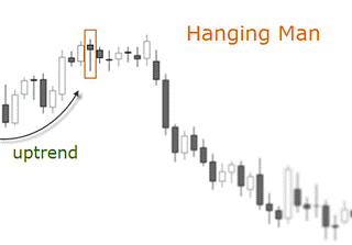
2.9. Hanging Man candlestick pattern
The hanging man also consists of a candle and it is the opposite of the hammer. If a hammer-shaped candlestick occurs after a rally, it is a potential top reversal signal.
The light shape suggests a hanging man with dangling legs. It is easily identified by the presence of a small real body with a significant large shadow. A real hanging man must appear at the peak of a trend. All the criteria of the hammer are valid here, except for the direction of the previous trend. The body may be empty or filled in; it may show a very small shadow at the top; the lower shadow must be twice the size of the body; and the body must be at the upper end of the trading range to be considered a bearish reversal signal.
Do candlesticks work across all time frames? Yes, they should work in all timeframes as the market dynamics behind its construction are the same in higher charts than in lower ones. But someone using a very short time frame like a one or five minute chart should be warned that there is more noise on small time frames, and that the opening and closing prices of these candlesticks are not as important as they are on a daily chart.
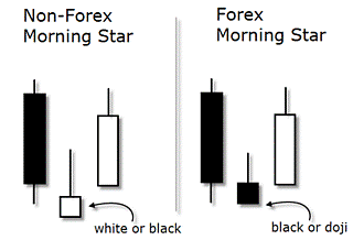
2.10 Morning Star candlestick pattern
The classic morning star is a three-day bottom reversal pattern on a Japanese candlestick chart. Like the planet Mercury, the morning star foreshadows that sunrise, associated with brighter events, is about to occur.
On the first day of the pattern, the course is still in a downward manifestation through a long real body. The following candlestick has a small real body compared to the previous one. And finally, the last candle is a candlestick that returns more than halfway into the real body of the first candle. It represents the fact that the buyers have now stepped in and taken control.
Regarding the validation criteria used in Forex, the middle candle, the star of the image, has two different criteria as opposed to non-Forex environments: firstly, it does not need to be gap down as in other markets; secondly, its real body will be mostly bearish or a doji. There are quite a few varieties of the morning star.
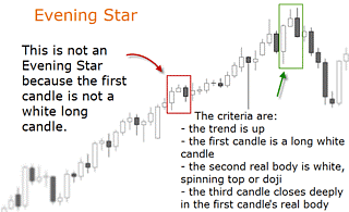
2.11. Evening Star candlestick pattern
This pattern is the opposite of the morning star. It recognizes when the price stagnates after an upward trend and does so in the form of a small candle. In Forex, this candlestick is mostly a doji or a spinning top, before a third candle that closes well below the body of the second candle and deep into the body of the first candle.
The first light must be relatively large compared to the previous light. This candlestick pattern generally indicates that confidence in the current trend has eroded and that bears are taking control. The classic pattern is formed by three candles although there are some variations.
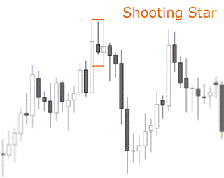
2.12. Shooting Star pattern
This single candle pattern has the following recognition criteria: it occurs when the price has risen; the first candle must be relatively large; the second candle has a small real body at or near the bottom of its range; and the upper shadow is twice as long as the body.
On a Forex chart, the color of the candle is not validation criteria. Shooting Star is a bearish reversal signal as its shape indicates that the price stalled during the session, but pulled back to the bottom to close near the opening price. This means that initial demand drove the price up, but sellers came in and introduced their supply.
Candlesticks and Ichimoku / Technical Analysis
– Hardcover, Swedish, 2018
Author: Tobbe Rosén
This is Tobbe’s fifth book on trading. The book teaches you how to interpret graphs using candlesticks and Ichimoku, both of which originated in Japan. You will learn in an easy-to-understand way how different formations reverse or reinforce psychology. As Mr. Sanjin, the creator of Ichimoku, said: “There is a risk of not seeing the whole picture but only the trees and missing the forest”.Ichimoku’s system gives you an invaluable overall view in just a few seconds.
At the end of the book you will learn several strategies and how to trade them. Peter Nilsson, author of, among others, the book on guerrilla trading, Edge – lift your stock trading to a new level and Successful stock trading – 10 winning strategies, writes the following about the book: “The book is not only aimed at beginners. To my knowledge, several of the concepts and techniques have never been described in Swedish before. There is something for everyone here. For those who want to learn technical analysis and trading, it is important to carefully examine the competencies of the teacher. Tobbe Rosén belongs to the top layer”.
In the book Become a Winner with Candlesticks and Ichimoku, you will learn from years of experience in the fields of trading psychology, analysis and hands-on trading. Peter Nilsson: “Make room on the bookshelf for the new addition next to Tobbe’s previous books, but don’t let it sit there collecting dust”.